
How I helped to improve the user experience of Kanopy's most popular video streaming platform.
.png)
Kanopy is a diverse and curated resource of thoughtful and independent films for public libraries and universities. The web video streaming experience is the most used and most important Kanopy's platform, which makes up to 65% of the Monthly Active Users (MAU).
The project started with an engineering goal to migrate the back-end system and saw an opportunity to build a user-friendly front-end web experience from scratch. As the Product Designer lead, I worked with the Product Manager and Engineering Lead during the entire project to successfully ship the streaming website from 0 to 1.
Product Designer Lead
Prototyper
UX Research
Review & QA
CPO, Product Managers, UX Researcher, Customer Support, UX Writer, Engineering team, Marketing team, Content team
Web & Mobile Web
February 2022
Figma, Photoshop, After Effects, Jira
.png)
Easily choose to play any movies or documentaries. Watch a trailer before playing or save any video to your watchlist and watch it later.

Browse by categories specially crafted for your entertainment or for educational purposes. Search content by the title, keyword, studio, and more.

Browse by categories specially crafted for your entertainment or for educational purposes. Search content by the title, keyword, studio, and more.
Keep track of everything you are watching. Continue watching where you stopped/paused, or start watching new content from a Watchlist/Playlist.

Explore and watch movies and series curated for young children in a safe space. Set up parental controls and control the content kids have access to.

Explore and watch movies and series curated for young children in a safe space. Set up parental controls and control the content kids have access to.
I worked with the Product Manager and other stakeholder to document all the design work included in the project scope. I created a website where I shared my analysis of all the existing pages, including screenshots of the current product, our design assumptions to be validated in user testings, and design references for each one of the pages.
I also included the pages that weren't going to be redesigned so all the stakeholders were aware about what to expect on this first version of the web redesign.

The Research phase was broken down in many tasks that were important for me and my team to make design decisions moving forward with the project. Some of the outcomes were:
Shadowed user interview sessions led by the UX Researcher to gather insights and feedback from users of the Kanopy web platform. The User Interviews report was another informative resource of the users' pain points with the product.
Worked with the UX Researcher and the Product Manager to define who we were designing for, their streaming habits and personal goals with Kanopy, as well their likes and struggles with their favorite streaming products and services.
The Product Manager, the engineering team and I gathered quantitative data from the product's performance to help us make better design decisions.
It was important to analyze how other products and services in the same industry work, as well as the best UX Design practices for similar products.
One of the outcomes of the UX Research was the redesign of the information architecture of the Kanopy's streaming website. It was important to validate our design assumptions about what was working and what wasn't working before jumping into any medium/high fidelity designs.

There was not a clear way of navigating on the previous Kanopy Streaming website. Many features were hidden under the hamburger menu and several users said they have never used those features.

Based on user feedback, I redesign the Kanopy's web Information Architecture. Then I worked with the UX Researcher to conduct user testing sessions to validate this IA, which had successful feedback.
The Kanopy app is available in the US, Canada, Australia, and the UK. I worked with the Content Team and Marketing team to highlight the content on the Landing screen that would work for multiple territories.
In partnership with the UX Researcher, I prototyped designs and helped writing the user testing sessions plan. We conducted several user testing sessions with current Kanopy's users to help us make better UX Design decisions.
I decided to run the user testing at the early stages of the designs to validate the new Information Architecture and interactions.
It was a crucial decision to move forward with the designs. We got positive feedback that was shared across teams.

Every part of the new user experience was carefully designed to provide the easiest access to browse, search, and enjoy all Kanopy video streaming content. Learn some of the UX improvements below:
The previous website had an extensive list of categories that were grouped by Subject, which was most applied to the education public watching Kanopy's content. Users from Public Libraries mentioned they'd like to know what's new in the platform and suggested new categories.

I worked closely with the Content team at Kanopy to craft the Browse Categories according to Kanopy's user types/personas: Public Library users that browse for entertainment content, and Education users who browse content related to a subject or class. New categories were added and easier to find in the website.
.png)
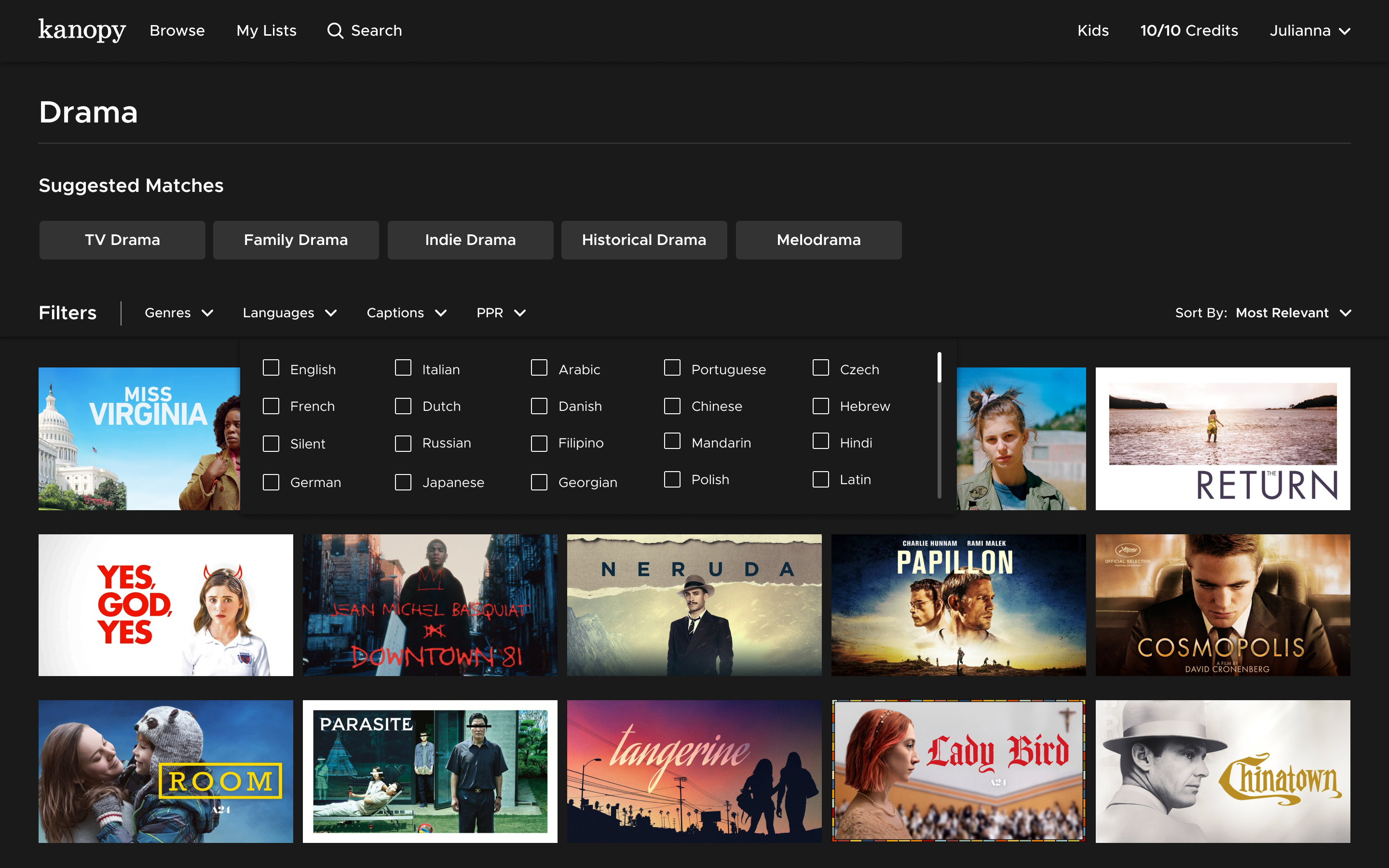
The Search Results were presented in 4 different tabs: videos, subjects, people, and companies, which the last three were not used by users at all. It also showed an extensive list of Filters on the left panel that were also not used by most users, and an extensive description of videos that didn't help users making a choice of a movie or documentary.
.png)
On the new Search Results page, the search bar was placed on top of the page, followed by Suggested Matches to help users find new content, and filters that are most important for users. Those filters also changed according to user type (e.g: Genres crafted for education purposes, similar to the browse navigation).
Most users interacted only with the Watchlist and Memberships pages and didn't find the content of the other tabs relevant. For the Public library users, the Memberships page had multiple library card status that were confusing, such as the difference between inactive and reactive status of different memberships and what the users could do about each status.
.png)
For the redesign of the user dashboard pages, the team and I kept the most important information relevant for the user's account: My information (such as email attached to their account and password), My Libraries (in case they had a library card in multiple libraries and/or access through an university/college), and the parental controls (for kids content).

One of the main outcomes of this project was a brand new design system that I built on Figma as a web library. It was a big piece of the collaboration between me, as a product designer, and the entire development team implementing the new video streaming designs.

As the main outcome of the project, the new Kanopy web streaming is now available in more than 200 countries, 4,000 libraries worldwide, and it's designed to be responsive on all screens.
.png)

